Thursday, February 9, 2017

New Android app: Complete Reference for the Pathfinder Roleplaying game.

Complete Reference for Pathfinder Roleplaying game

New app for the Pathfinder Roleplaying game.

We released a new Android app, Complete Reference for PF-RPG, to be used for every player and Game Master of the Pathfinder Roleplaying game. The app is meant as a very quick and easy to use reference along with a wide variety of tools for combat handling and GM'ing.
It contains all the content from the Pathfinder Reference Document under the OGL, and can be easily expanded by homebrew content using the in-app or online editors.

To give some examples of how you can use the app:

You want to know what Arrowmaster's Bracers are
You just got a magical item from an encounter and after identifying the item you now know they are Arrowmaster's Bracers. You quickly open the app and search for "Arrowmaster" in the search all field. The first result is the item you are looking for and you note the details on your character sheet and bookmark the item for later reference.

As a game master you need to prepare encounters
You can use the app to search for monsters using all kinds of handy features. In this case you could for example search for a list of monsters with a challenge rating below 6 that live in desert areas sorted on challenge rating. The app provides you immediately with the list requested and you can bookmark the monsters of interest.
Once the encounter takes place in a session you can find the monsters in the bookmark section and add them to the initiative tracker inside the DM Tools to further manage the battle and keep track of your players.

As a player you need to keep track of numerous spells and details.
Using the bookmark and category views you can easily keep track of your complete spell book and backpack full of magical items.

Additional DM tools


Next to the numerous resources and ease of use, there are also the additional dungeon master (game master) tools. With the DM tools you can use your phone as a dice roller, generate random dungeon maps and track players initiative. Additionally, there are some handy name generators and sections to keep campaign notes and visited locations.
You can also use your Android Watch as a dice roller!

Sharing and Homebrew content

You can also share content and add your own home rules and content using our online tools. Using the online forum for the Complete Reference PFRPG app, you can easily discuss, report bugs or download additional content directly into the app.

Apply for a free forum account to use the online content editor.

Thursday, September 22, 2016

How to replace the battery of Game Boy games.

Today I was doing something very different than what I am usually working on, I decided to fix my old Game Boy Color game of Pokemon Gold.
The method I explain can be used on any Game Boy Color, and other Nintendo games.

The problem with the game was that you could not save the game and load your saved games.
You do not see the "continue" option in the menu when you start the game. This is due to the little battery inside the card, which is needed to remember the save games and the internal clock.
To make the save games work again we need to replace the internal battery that has run dry over the years with a new one.

The battery inside the game is a CR2025, this flat round battery that you can buy almost anywhere.
CR2025 battery you need
There are basically two ways of replacing this battery:

  1. The professional way: by using a solder to unsold the old battery and put in place a new one.
  2. The easy way: by using electronic tape to hold the new battery in place and some subtle torque to undo the old battery.
Since I do not have a solder, and I do have electronic tape, the choice was easy.

To replace the battery, whichever method you choose the first thing you need to do is open the game card. The Game Boy games and other Nintendo games are closed with a little special security screw. The easiest way to open these is with a security bit, you can buy one for 4 euro online.
How the Pokemon Gold game looks just after opening using the security bit.
 After opening the game, we can see the old battery clearly in the top right corner. The battery is held into place by two iron brackets that are soldered to the board.
We can use a little screwdriver or another small object to carefully put strength on the positions where the iron brackets are attached to the battery. There are two times two attachments points on the top and the same amount on the bottom of the battery. This is the most tricky part since we do not want to hit anything else, so carefully put enough strength to break the battery free from its position. If you choose to go with the solder method, then you can heat up the solder points next to the battery to remove it.
I used a little twister to break the attachments points and was able to remove the battery fairly easy without damaging anything else.

Removed the old battery with the twisters on the right. 
The battery has the + side at the bottom, so make sure that you also put the new battery with the plus side at the bottom. Once the old battery is out you can use a piece of electrical tape to hold the new battery against the two iron brackets. Put some tape below the lower bracket and lay the battery on top, close the above bracket firmly on top of the battery and put the remainder of the tape over the bracket and battery to hold everything firmly in place.


The end result can be seen in the image on the right. The new battery is snug and tight in the electrical tape and the game is almost ready.

Last step is to slide the lid back on and put the security screw back in.
The final result: We can save and load the game again!

It works again! Continue a previous saved game.

Sunday, April 27, 2014

Working with custom shapes, a fiddle with scripting and math


Settlers of Catan

A friend of us asked if it was possible to create a simple Settlers of Catan board generator. After some fiddling we had a basic concept working, with a random default board being generated and a click listener being placed on all the different tiles we could change images / colours of the tiles in a simple fashion.
 We did however run into some difficulty when we wanted to distinguish between the images being clicked, because each line of the game board overlaps the line above. Formally: every line n overlaps line n-1 with the height of the triangular part of the image.

For those unfamiliar with the game board of the game , it basically is a hexagonal shape with hexagonic tiles representing wood, stone and other resources.
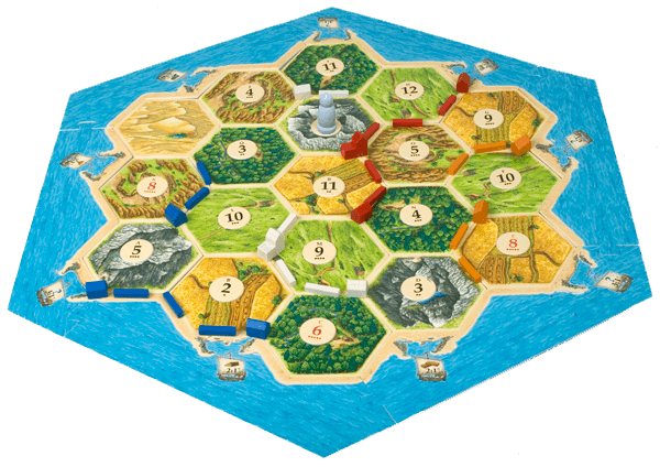
Settlers of Catan game board

In our fiddle we turned the board around 90 degrees to make the hexagons 'face up'. But the technique we use is universal so it will work for any orientation and any shape.
Below we explain what we did and why we did it the way we did it. Our code is posted as a reference, and if you want to you can use it. I went through what we wrote and translated what I could find in Dutch to English, but there might be some words/variables that are still in Dutch.
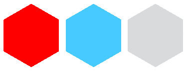
Three hexagons in the orientation we use them

Diving into the HTML

 First of all lets create a very simple HTML5 page that will hold the game board.

<html>
    <head>
        <link rel="stylesheet" href="css/style.css"  charset="utf-8"/>
        <script src="./js/jquery.js" type="text/javascript"></script>
        <script src="./js/script.js" type="text/javascript"></script>
    </head>

    <body onload="javascript:placeshapes();">
        <div id="explanation">Click on a shape to make it change color</div>
        <div id="playingfield">
            <!-- playingfield will be generated here-->
        </div>
    </body>
</html>

As you can see the HTML is very simple, we include a stylesheet, jquery and our own script. The body of the HTML contains 2 divs. One with some text to explain what the page does, and one to hold our game board.


Some scripting

Now let us create the game board with all the shapes we want. We do this dynamically via Javascript to make it easier


function placeshapes(){

var top = 0; 
    for (var x = 0; x < 7; x++){ 
        var left = 0; 
        for (var y = 0; y < 10; y++){ 
            if (x%2 == 0){ 
                $('#playingfield').append("<div class='tile' style='position:absolute; left:"+ left+ "px; top: "+top+"px;'><div id='id"+ y +""+ x +"' class='top'></div><div class='middle'> </div><div class='bottom'> </div></div>"); 
            }else{ 
                $('#playingfield').append("<div class='tile' style='position:absolute; left:"+ (left+63)+ "px; top: "+top+"px;'><div id='id"+ y +""+ x +"' class='top'></div><div class='middle'> </div><div class='bottom'> </div></div>"); 
            } 
            left+=126; 
        } 
        top+= 104; 
    }
               .... 

} 

There are multiple things happening in this function. first of we have a double for loop that runs through the board. We create 7 lines, all with 10 tiles, neatly tucked together. we use absolute element placement, because we are going to be calculating from the clicked div locations. Relative placing with negative margin-Top styling is also possible but makes the calculation more difficult.
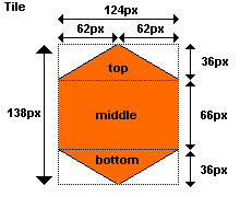
Tile dimensions
The tiles
 The tiles we create are 124pixels wide, and 138 pixels high. and are represented with 4 different divs. We have a 'global' div which is the Tile div, and in that div we distinguish 3 different divs, one for the top part, one for the middle part and one for the bottom part. This is necessary to be able to recognize which div is clicked.

By using 3 sub divs to describe the shape of the item, it is easy to work with either full CSS, or with images, because an image can be set to the background of the tile div, and the click listeners will still be useful on the sub divs.

The CSS tile styling
#playingfield{
    width: 1330px;
    height: 770px;
    background-color: #0E71B4;
    position: absolute;
    left: 10px;
    top: 50px;
}
.tile{
    height: 138px;
    width: 125px;
    position: absolute;
    margin-left: 3px;
}

.tile .top {
    width: 0;
    border-bottom: 36px solid #6C6;
    border-left: 62px solid transparent;
    border-right: 62px solid transparent;
}
.tile .middle {
    width: 124px;
    height: 66px;
    background: #6C6;
}
.tile .bottom {
    width: 0;
    border-top: 36px solid #6C6;
    border-left: 62px solid transparent;
    border-right: 62px solid transparent;
}
Now our game board should look something like this:
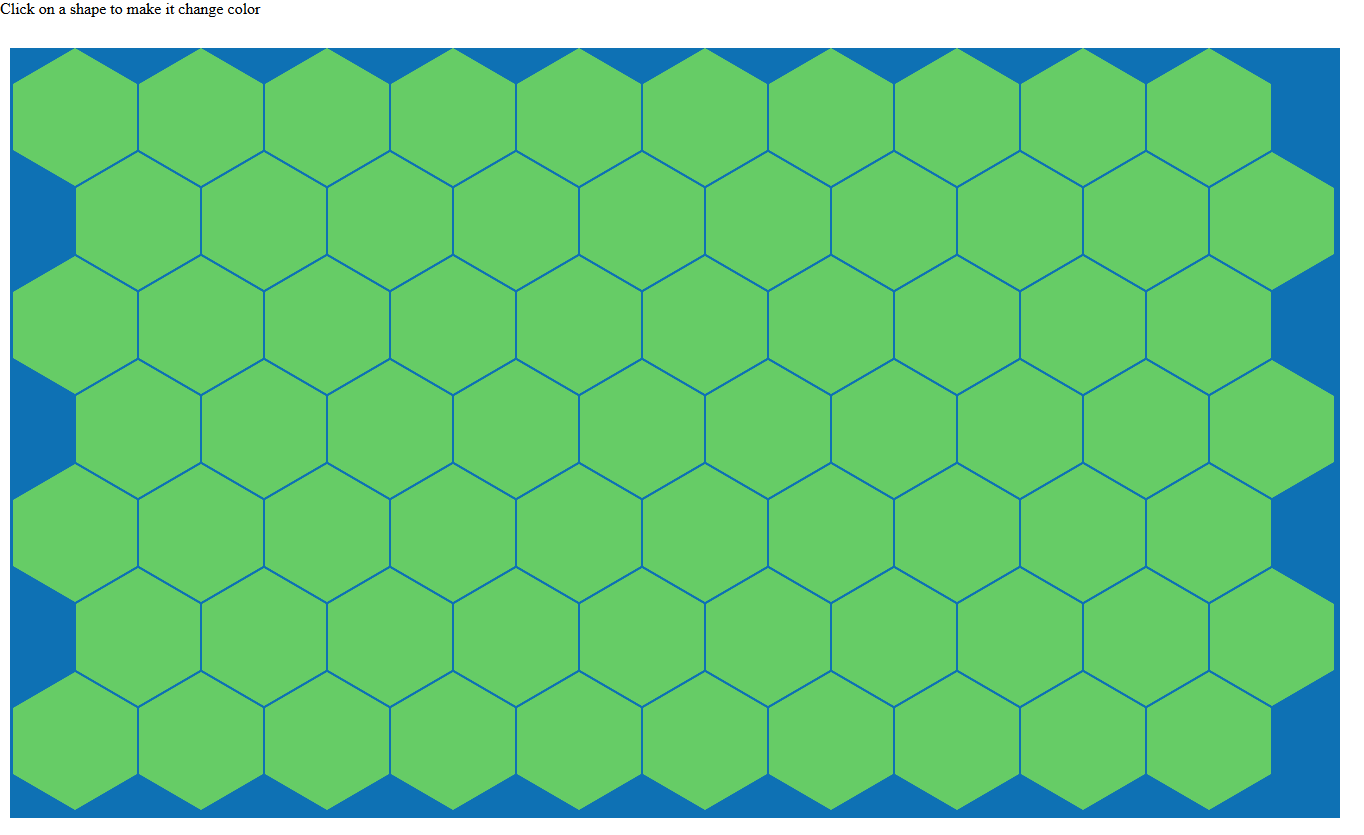
generated gameboard

Basic onClick listener
On to creating an onClick listener for all the tiles, to be able to make them change colour
$('.tile .middle').click(function(e){
    var i=0; 
    for (i=0;i<colors.length;i++){ 
        if ($(this).css('background-color') == colors[i]){ 
            $(this).css('background-color',colors[((i+1)%colors.length)]);  
            $(this).parent().children().first().css("border-bottom","36px solid "
              +colors[((i+1)%colors.length)]); 
            $(this).parent().children().last().css("border-top","36px solid "
               +colors[((i+1)%colors.length)]); 
            i= colors.length; 
        } 
    } 
    return false; 
});
This is the click listener for the middle part of the tile. We use an array with colours called colors that holds rgb values. This array can be changed to hold images, which can then be iterated and set to the parent of the clicked item.
In this example we work with CSS creation of the hexagon we not only need to change the colour of the clicked div but also of it's brothers. we know there are 3 children of which this is the middle one, so we can use the jQuery first() and last() functions on children of the parent.

The fun part:
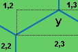
All the basics are implemented, now we need to make a click listener that will work on the overlapping parts of the game board. To achieve that, we are going to focus on the top left part of the Tile and than specifically at the line between tile (1,2), and tile (2,3) where the numbers are equivalent to the coordinates of the tiles given in the id attribute of the div with class top in the respective tile divs.
bouding box y when clicked on div with class top.
If we click on the div with class top we click in bounding box y. half of the surface in the box is surface where we do not want the click listener to change the current tile (2,3) but where we want the click listener to change tile (1,2) or (1,3). First we focus on the right half of y. Basically we want all the clicks below the diagonal line to change the clicked tile, and all the clicks above the line to change tile (1,2).

A way to detect if the clicked location is below the line is by calculation of the angle from the clicked coordinates to the bottom left corner of the bounding box. because we know the specific dimensions of the hexagon, we can calculate the angle of the reference corner. In this case the height is 36px and the with is 124/2=62px. The reference angle is 30.14°. All calculated angles that are below 30.14° should make the clicked div change colour.

The theory looks solid
Getting the clicked location is the next thing we need to do. In jQuery when using the .click function the given parameter, in our case e is the click object. We can extract the coordinates of the click from that object

var offset = $(this).offset();
var left = e.clientX - offset.left;
var leftold = left;
if (left> 62){
   //we use this for the right part of the top div
   left= 124-left;
}
var top = (-(e.clientY - offset.top))%36;

so we got the coordinates of the click location. they are numbers between (0,0) and (124,36). If we just blindly use these values we will not get the result we are hoping for. This is because in HTML elements in the DOM are referenced top down, left to right. which means that the origin to which we calculate the angle is not situated in the bottom left corner, but in the top left corner. So we have to map these values in such a way that the angle we calculate is the correct one.
We map the coordinates in the following way:
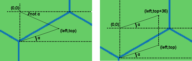
Mapping to Origin
Now if a user clicks in the right part of the top div we want to also calculate the angle but in effect the angle should be calculated towards the bottom right corner in stead of to the bottom left corner. We have an extra mapping that we need to do to achieve this.
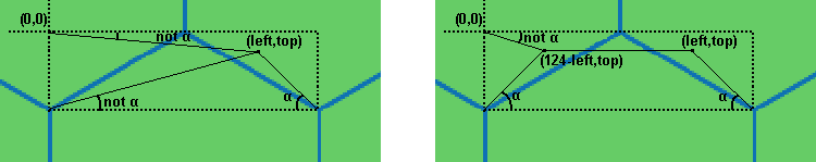
Mapping to left part angle. after this mapping the mapping to the Origin still needs to be done.

With all this knowledge in hand we know how to solve the issue and make sure that wherever we click on the tile the correct  tile will be changed.

The complete on click function will look like this:

$('.tile .top').click(function(e){
    var offset = $(this).offset();
    var left = e.clientX - offset.left;
    var leftold = left;
    if (left > 62){
        //translation to left side
        left = 124-left;
    }
    
    var top = (e.clientY - offset.top);

    //translation to origin
    var rad2deg = 180/Math.PI;
    var tan = -Math.atan((top-36)/left) * rad2deg;

    if (tan < 30.14){
        // angle is smaller than reference angle so change
        // this div background color
        var i=0;
        for (i=0;i<kleuren.length;i++){
            if ($(this).parent().children().eq(1).css('background-color') ==
                  kleuren[i]){
                $(this).parent().children().eq(1).css('background-color',
                        kleuren[((i+1)%kleuren.length)]); 
                $(this).parent().children().first().css("border-bottom",
                        "36px solid "+kleuren[((i+1)%kleuren.length)]);
                $(this).parent().children().last().css("border-top",
                        "36px solid "+kleuren[((i+1)%kleuren.length)]);
                i= kleuren.length;
            }
        }
    }else{
        //get id of clicked div for coordinate calculation
        var thisid = $(this).attr('id');
        var idarray = thisid.split("");
        if (idarray[3] == 0){
            //top row so we don't have to change color
            return false;
        }
        var help = idarray[3] - 1;
        var even = false;
        if (idarray[3]%2 == 0){
            even = true;
        }

        //angle is bigger, first check left side
        var id = "";
        if (leftold < 62){
            //construct id of div to change
            id = "#id" + idarray[2] + "" + help;
            if (even){
                if (idarray[2] > 0){
                    var help2 = parseInt(idarray[2])-1;
                    id = "#id" + help2 + "" + help;
                }else{
                    //left most column
                    return false;
                }
            }else{
                if (idarray[2] < 9){
                    id = "#id" + idarray[2] + "" + help;
                }else{
                    //right most column
                    return false;
                }
            }
        }else{ //then check right side
            id = "#id" + idarray[2] + "" + help;
            if (even){
                id = "#id" + idarray[2] + "" + help;
            }else{
                if (idarray[2] < 9){
                    var help2 = parseInt(idarray[2])+1;
                    id = "#id" + help2 + "" + help;
                }else{
                    //right most column
                    return false;
                }
            }
        }
        //change color of calculated div
        for (i=0;i<kleuren.length;i++){
            if ($(id).parent().children().eq(1).css('background-color') == 
             kleuren[i]){
                $(id).parent().children().eq(1).css('background-color',
                 kleuren[((i+1)%kleuren.length)]); 
                $(id).parent().children().first().css("border-bottom",
                 "36px solid "+kleuren[((i+1)%kleuren.length)]);
                $(id).parent().children().last().css("border-top","36px solid "
                   +kleuren[((i+1)%kleuren.length)]);
                i= kleuren.length;
            }
        }
    }
    return false;
});

To summarise
As said this technique is multi-purpose. with the correct maths you can calculate anything you want. just keep in mind that every shape needs its own function to handle the exceptions and that the origin of the coordinates in HTML is located at the top left corner of the bounding box.

Live demo!


Tuesday, May 14, 2013

Responsive webdesign


2013 is the year of responsive web design (RWD). But what is responsive web design and how can we use it?
Not even five years ago almost everyone was browsing the Internet with laptops or a desktop computer. The life of a web developer was relatively easy, from 800x600 till 1900x1440 screen sizes you needed to cover but not much more. You could create a totally static page with just one set of layout rules and everybody would be happy, and every browser would display the page the way you made it.

Today however, people browse from thousands of different devices, from phones to tablets, Eee pads, laptops, computers and even iPods. All of which have different screen sizes. This drastically changed the web development approach, introducing media queries and a new way of designing websites: responsive web design.

What is responsive web design?

Responsive web design is a design approach with which we try to create one website for all devices. The basic elements of responsive web design include a fluid grid concept, flexible images and media queries.

Fluid grids

A fluid grid is a grid of elements usually divs, that all have proportional sizes (percentages instead of pixels). When all the elements of the grid have their width and or height proportional to the size of the screen it scales on all devices. This is already a nice thing, though we should also make sure that the content of the grid is resizes as well.

Flexible images

​If there is something to be flexible then this is in the first place the images we use. Flexible images are images with their width in percentages instead of pixels. Usually they have their width to 100% of their container. This way the image will never run outside its boundaries. Drawbacks can be though that the image becomes too large on HD screens, resulting in a pixelated appearance. Or the image becomes so small on small screens that it becomes useless.

Media queries

With media queries in CSS you can apply specific CSS rules only when certain conditions apply. You can for example create a media query on Max-Width. 
@media screen and (max-width: 600px) { img{ width: 100%; }}
Now the image on this site will appear 100% of the container width if the screen width is smaller or equal 600px. If the screen is larger, the image will not have the 100% rule. This way we can for instance make a web page with an image and a few lines of text appear on small screens like:

And on big screens like:
This we can do with the Media query max-width, and by setting "float:left;" for the image.
We can also use media queries for a whole css stylesheet. To do so we need to add the media query declaration in the head of the html file.
<link rel="stylesheet" media="screen and (max-width: 600px)" ...
We can do many more media queries so to adapt our design for all kind of devices.
On this site from CSS-Tricks you can find a nice list.

Text in responsive designs

Text in responsive websites can give problems. For instance the text might be too big for the container that holds it. To solve those problems we can make sure that the containers height varies depending on the text, but sometimes this is not what you want. If you want to keep the restrictive height the only solution is cutting the text nicely and making sure the whole text can be seen in another way. A solution could be a "more" button for example that enlarges the container when clicked.

Clipping the text we can achieve by applying the following css rules:

overflow:hidden;
text-overflow:ellipsis;

The first rule makes sure the text is not visible outside the container, the second line makes sure that the clipping of the text is rendered like "...".
This can also be handy with titles in headers for example. If the title on a mobile phone header is too big,  it is usually not a problem whether the text is clipped. If the text is not clipped however it will run out of the header and might break the style of the page below.

Saturday, May 4, 2013

An introduction to Android 2d Game Development

Ever wondered how you could develop a game in Android? Do you need to start from scratch with OpenGL and code the wheel yourself?
No you don't have to do that, instead you can use a vast improving engine written for you: AndEngine.

We as app developers at Van Stein & Groentjes use this engine in most of our interactive Live Wallpapers (like the GolfLive Wallpaper) and in some of our games (HoverRace). As a small contribution to AndEngine developers team We'd like to explain a little bit how it works and to give you some tips and tricks.

To set up a new AndEngine project the best thing to do is follow a tutorial from: AndEngine Forums.
I recommend to use the Eclipse environment and specifically the one android offers with ADT.

When you followed these tutorials, set up your new game project and when you linked the AndEngine libraries to the build path of your project we can start with the code.

Scenes and cameras.
First of all let us explain something about the structure of OpenGL in general.OpenGL uses scenes. A scene is basically what you think it is. Every level in a game is a scene. Just like on the movieset, in every scene you have a setting or world in which your game takes place and a desired flow of events. To navigate in a scene, OpenGL uses a camera, this camera is usually centered around the main character/object in the game, and as it moves the camera moves with it. Below is an explanation of these two elements and their relation to each other. Every level, menu, movie etc can be seen as a scene.

Camera size can vary depending on the goal you have. For example if you have a game in which a character can walk and can run, you might want the camera to `zoom out' when the character is running such that the player can better see what is coming.

In your gameactivity .java file we need to implement several functions.
  • public EngineOptions onCreateEngineOptions()
  • public void onCreateResources(OnCreateResourcesCallback pOnCreateResourcesCallback)
  • public void onCreateScene(OnCreateSceneCallback pOnCreateSceneCallback)
  • public void onPopulateScene(Scene scene, OnPopulateSceneCallback populateSceneCallback)

onCreateEngineOptions()

This method is were we define the options to the game engine, the options are for example that we want to run the game fullscreen, in landscape mode and with a resolution policy of 1024*800 and that we use a particular Camera object to look at the scene.
In code that looks like:
return new EngineOptions(true, ScreenOrientation.LANDSCAPE_FIXED,
         new RatioResolutionPolicy(CAMERA_WIDTH, CAMERA_HEIGHT), this.mCamera);
Where this.mCamera is a camera object of the AndEngine Camera class.
You can use a fixed camera but also dynamic camera types like a boundCamera is possible. A boundCamera object can follow entities on the scene.

onCreateResources(OnCreateResourcesCallback pOnCreateResourcesCallback)

The second method that we run into is the loading of resource files. If you want to create a game you need graphics usually. In AndEngine you can load an image by using TextureAtlas and TextureRegion objects.
A texture atlas is a big texture map where you can define several texture regions that you want to use in your game. The advantage of using a TextureAtlas object is that you only have to load 1 image that contains all the images you need. This image is loaded into memory and the AndEngine can then take what it needs from this image by selecting texture regions..
We initialize the texture atlas objects like:

BitmapTextureAtlas mTexture = new BitmapTextureAtlas(this.getTextureManager(),2048, 512, TextureOptions.BILINEAR_PREMULTIPLYALPHA);

With this code we initialize a texture atlas of the size 2048x512 and with the texture option BILINEAR_PREMULTIPLYALPHA. This option has effect on how an image is scaled if it needs to, and determines how the color values are calculated. After defining the texture atlas we need to load the atlas into main memory. We do so by calling the load() function.

mTexture.load();

Now we are ready to load our images into texture regions:

mTextureRegion = BitmapTextureAtlasTextureRegionFactory.createFromAsset(this.mTexture, this, "sky.jpg", 0, 0);

With this line of code we load an image from the assets folder that is called sky.jpg and probably contains some cloudy artwork. We load this image at the top left corner of our TextureAtlas (0,0). If this image is 20x20 for example, we can load the next picture in the same atlas at coordinates (21,0).
After we are done loading all the images we have to let the engine know that we are done and want to move on with the rest of the work, we do this by calling the callback function.
pOnCreateResourcesCallback.onCreateResourcesFinished();


onCreateScene(OnCreateSceneCallback pOnCreateSceneCallback)

In the onCreateScene method we define the scene of our game.

Scene scene = new Scene(); //Create the scene object
Furthermore we can define a heads up display (HUD) and attach it to the camera.
HUD MainHud = new HUD();
mCamera.setHUD(MainHud);

In the HUD we can add images and controls that will not move if the camera moves and is always drawn on top of the scene.

After we created our scene object we can tell the engine what the scene is in the callback.
pOnCreateSceneCallback.onCreateSceneFinished(scene);

onPopulateScene(Scene scene,
    OnPopulateSceneCallback populateSceneCallback)

In the onPopulateScene function we can populate our just made scene object. The main building block that we can use is the Sprite object. Sprites are basically just image objects that we can draw on the screen and manipulate.We define a Sprite as below:
Sprite mSprite= new Sprite(300, 400, this.mTextureRegion ,this.getVertexBufferObjectManager());

The object is initialized with a specific TextureRegion (sky.png in our case) and with specific X (300) and Y (400) coordinate values. Depending on your camera, the object will be placed at 300 pixels from the left and 400 pixels from above the top corner of the screen (if the camera matches the screen).
Once we have loaded a Sprite we can either attach it to the scene or to the HUD with:
scene.attachChild(mSprite);
or
HUD.attachChild(mSprite);

When we are done populating the scene we can call the callback function to tell the engine we are done.
populateSceneCallback.onPopulateSceneFinished();

Now you have created your first 2D project using AndEngine!

Tips & Tricks

  • Never use images bigger than 2048x2048, harware acceleration does not support it.
  • Reuse variables that you use every screen update instead of creating new ones, memory management in java relies on the garbage collector and unfortunately this is slow.
  • Try to use images with a power of two size with their own textureAtlas, this reduces the change on glitter.
  • Check out the awesome extensions that exist for the engine!
  • For animated images use animated sprites. AndEngine has some cool functions to display a select part of an image.
  • AndEngine can take care of most of the worlds physics (gravity etc) So don't reinvent the wheel.

Tuesday, April 30, 2013

Hardware Acceleration in Android


Beginning in Android 3.0 (API level 11) we have the option to enable hardware acceleration.
Now what is hardware acceleration and why should we use it?

Hardware acceleration means that we use the GPU to do the drawing work instead of the CPU. The views on canvas will be exported to textures that will be drawn to the screen by using OpenGL libraries. This process is much faster then drawing them by using the CPU, however also much more memory consuming. Loading the OpenGL libraries takes 2 to 8 MB of main memory, if we eat even more memory by using large images or a lot of objects then on phones with limited memory we run into problems.

Because of the memory consumption Android does not allow images larger than 2048x2048 to be used during hardware accelerated events. Note that the actual image size might be even smaller since the image is first transformed to a texture, it is wise to not use images above 2000x2000. This means that if you want to work with larger images coming from camera's for example, you have to disable it.

Hardware acceleration can be switched on globally for the entire app in the manifest file.
<application android:hardwareAccelerated="true" ...>
But you can also enable it per activity and in the near future per window (not supported yet though), which would be more preferable since most applications would not profit from accelerated hardware in the main menu for example.

Crossplatform apps and hardware acceleration

In HTML5/JS cross-platform apps made by, for instance Phonegap/Cordova, hardware acceleration can improve the app significantly.
If we create a simple webapp with jQuery mobile and run it using Phonegap on a phone, we see that the transitions between pages are a bit staggering, the scrolling is not smooth and the reaction time is a bit slow, even on high-end phones.
Now we enable hardware acceleration and run the same app again. The transitions look amazing, scrolling is super smooth and the app reacts in no time!
 

In short: Hardware acceleration is an awesome new feature that Android 3.0 and above offers, but only use it when needed.


Wednesday, October 31, 2012

Are html5/javascript apps the future?

Nowadays html5 / javascript apps can be found a lot on the internet.
Also on mobile platforms as Android and iOS, html5 apps appear in the markets more and more often. The question is are these webapps the future or are they too limited and slow?


Webapps for mobile phones.
We can make webapps for mobile phones with the help of Phonegap/Cordova. Phonegap gave us the ability to convert our webapps into applications for mobile phones. Although applications made this way are noticable slower then native made applications, and they cannot acces all native features (yet), they are developed easily and can be used on all platforms without the need to rewrite code.

With libraries like jQuery Mobile you can create a nice looking app for Android and iPhone without the need to know anything about Objective-C or Android Java. All you have to do is write a web application in your favorite editor, test it in the major browsers and then with the help of Phonegap convert it into a native application.

So for mobile phones webapps are doing better and better. There are some advantages and some disadvantages. Lets create a little list.

Advantages:
  •  Easy to develop
  •  No knowledge needed in Java / other native language
  •  Crossplatform

Disadvantages:
  •  Slower
  •  Less native features

Now lets look at the disadvantages. Slower many people say, yes this is true a native application is faster then a html5 app and this will always be the case, you cannot make a faster app then doing it native. Though, new phones have faster and faster cpu and load html5 apps so fast that you almost see no difference with native apps.

Less native features, it is true that even by using phonegap you cannot access all native features from every device with the same html5 / javascript code. But, luckily here we can use phonegap plugins.
A large collection of already made plugins can be found here.
With phonegap plugins you can basically connect your javascript code with native code. This makes the options endless! Although it seems that the whole effect of crossplatform html5 apps is gone when you still need to implement native plugins. For now though this is a good solution for the few things that are not available yet in html5/javascript apps.

Webapps for desktops
In desktops webapps are not common and well used at the moment rather then by using a browser to go to the webapp. With the coming of Windows 8 this will already change quite a bit. Windows 8 will support webapps and even let users sell them in there kind of appstore. It is easy to convert your own webapp for Windows 8 with Visual Studio 2012 for windows 8.

Now I hear you say, If I don't have windows 8 (and there are also many reasons not to have it), I can not execute my webapp? You can!You can create an executable for windows, Linux or Mac OSX in seconds with appJS. This little tool simulates a localhost browser with your webapp inside. You can specify settings like title, screen size and others in the javascript file in the zip folder you can dowload from their website.

So now we can make webapps for internet, mobile phones / tablets and desktop PC's!
Are webapps the future? I think they are, although sometimes you cannot go without native.

We ourselves are working on a totally crossplatform product with an approximate release date of Januari 2013. Check our site to find out more.